Microsoft Edge redesign
Creating a design framework to allow the new Edge browser to scale.
My role
Product designer leading design systems, visual design, user flows
Deliverables
Comprehensive web and native design system, user flows, and differentiation features
Team
Product manager
UX design team
Design system developers
Web and native developers
Timeline
2018 - 2019
The what
Microsoft needed a scalable, consistent design foundation for the new Edge browser as part of its switch to Chromium. I helped build a shared design framework that supported the Core UX team and developers, delivering reusable components and unified visual guidance across the product.
The what
Microsoft needed a scalable, consistent design foundation for the new Edge browser as part of its switch to Chromium. I helped build a shared design framework that supported the Core UX team and developers, delivering reusable components and unified visual guidance across the product.
The what
Microsoft needed a scalable, consistent design foundation for the new Edge browser as part of its switch to Chromium. I helped build a shared design framework that supported the Core UX team and developers, delivering reusable components and unified visual guidance across the product.
The why
As Edge relaunched, the team needed a way to move quickly while maintaining consistency across a growing set of features. Without a cohesive system, teams risked duplicating efforts and creating fragmented user experiences.
The why
As Edge relaunched, the team needed a way to move quickly while maintaining consistency across a growing set of features. Without a cohesive system, teams risked duplicating efforts and creating fragmented user experiences.
The why
As Edge relaunched, the team needed a way to move quickly while maintaining consistency across a growing set of features. Without a cohesive system, teams risked duplicating efforts and creating fragmented user experiences.
The how
I led the design and structure of the component library, collaborated with engineers to ensure implementation readiness, and partnered with cross-functional teams to standardize patterns. The result was a design system used across Edge and other Microsoft products that accelerated development and elevated quality.
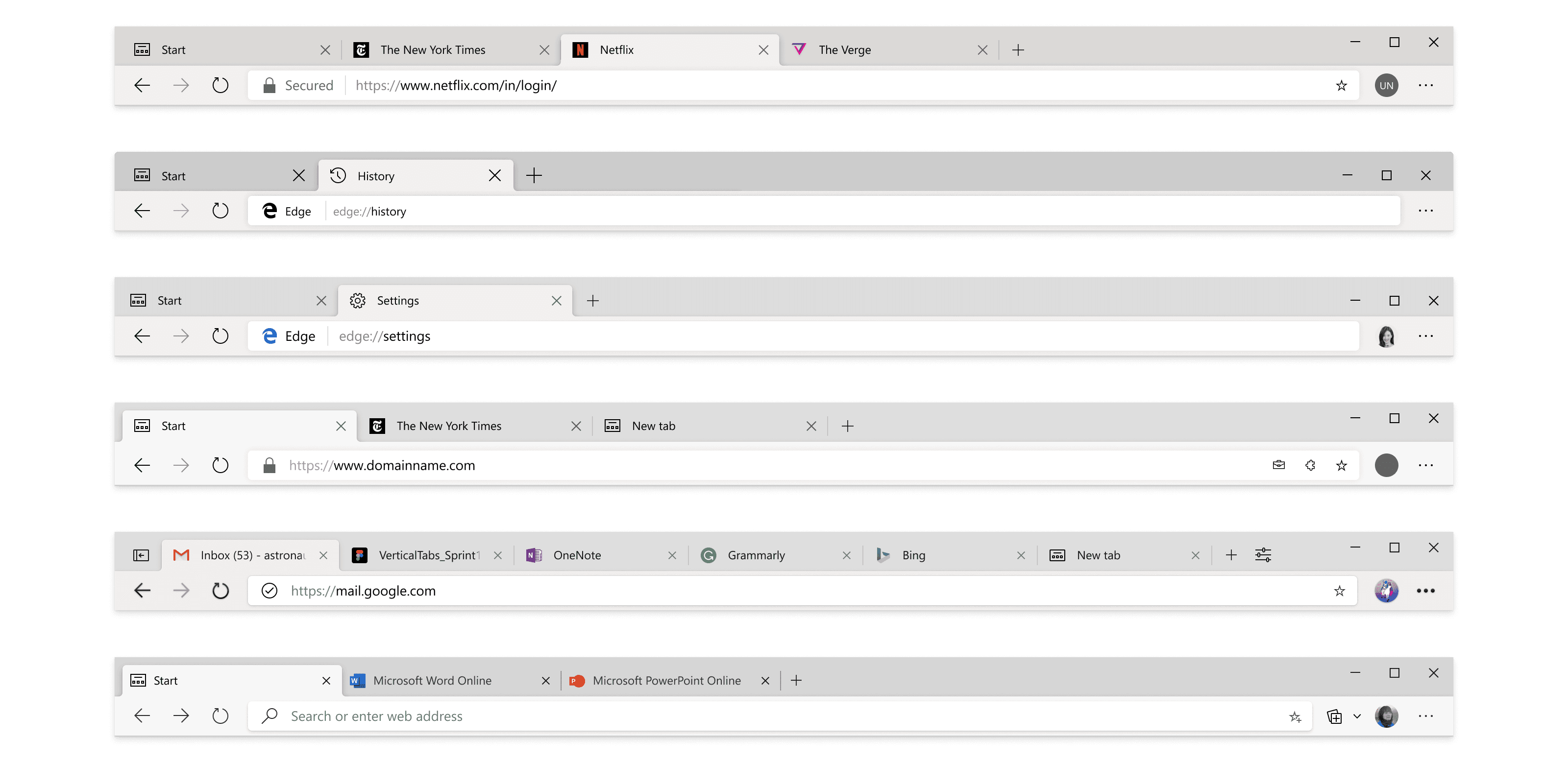
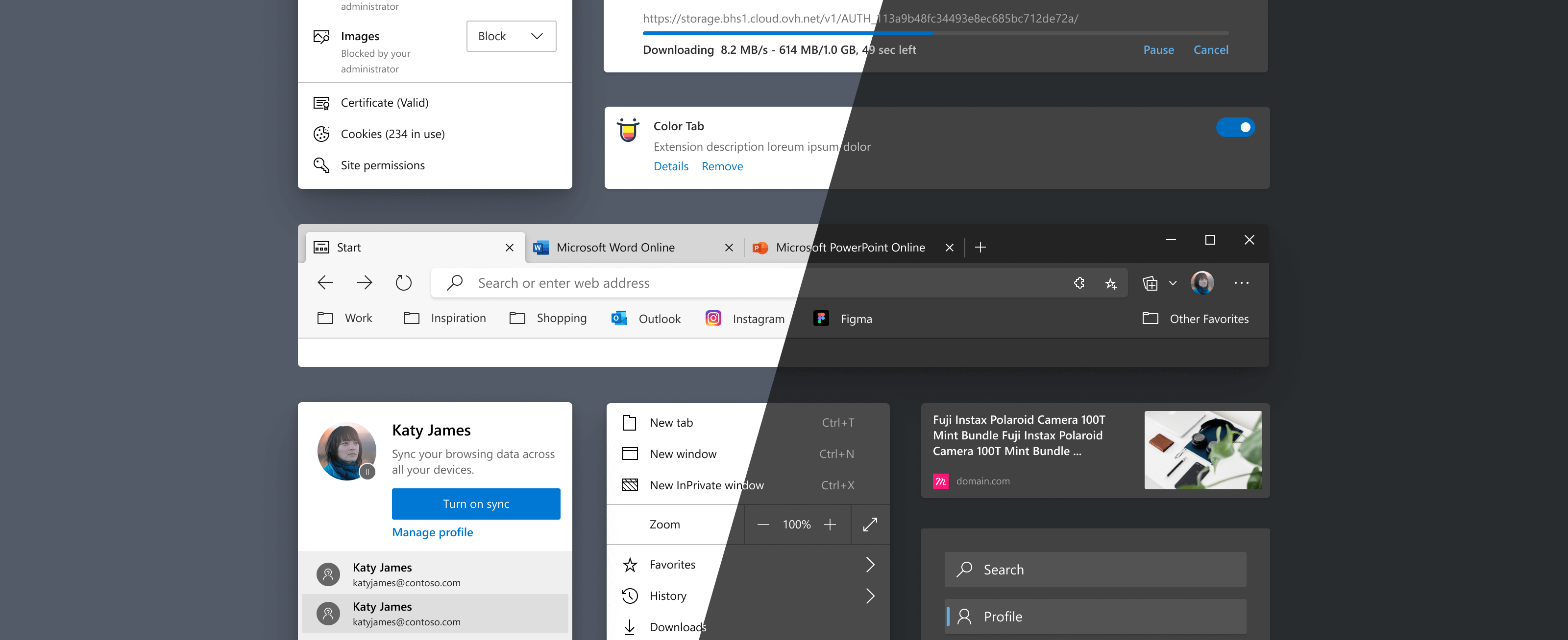
The problem
Before the design system, Edge's UI suffered from inconsistent design decisions across teams. Five designers created five slightly different browser frames, leading to confusion and rework. Engineering frequently had to ask which version was the source of truth, and designers spent time manually updating files to reflect the latest changes. Much of the design logic lived as tribal knowledge, making it hard to scale or onboard new team members effectively.
The goal
The main goal was to create a shared design system that aligned designers and engineers, reduced inconsistencies, and replaced tribal knowledge with clear, scalable standards. This allow designers and engineers to reduce the repetitive work, instead focusing on solving bigger problems.
The goal
The main goal was to create a shared design system that aligned designers and engineers, reduced inconsistencies, and replaced tribal knowledge with clear, scalable standards. This allow designers and engineers to reduce the repetitive work, instead focusing on solving bigger problems.
The goal
The main goal was to create a shared design system that aligned designers and engineers, reduced inconsistencies, and replaced tribal knowledge with clear, scalable standards. This allow designers and engineers to reduce the repetitive work, instead focusing on solving bigger problems.
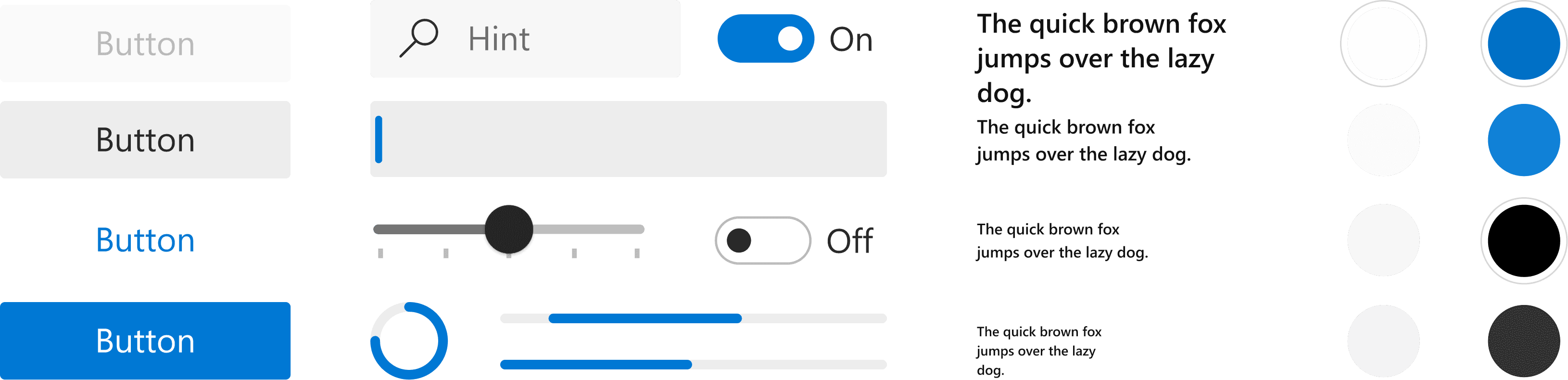
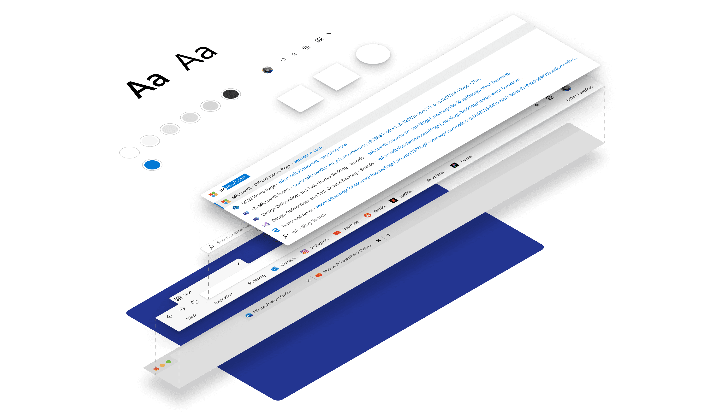
Laying the foundation
My team, Edge Core UX, worked closely with the Edge UX Engineering team to come up with a set of codified, foundational elements. These elements include colors, typography, elevations, and shapes. These atomic elements were what formed the basis for creating a language for Edge.
These foundational components were not limited to Edge, but designed to be open-sourced, available to any team at Microsoft or externally that wants to use them.
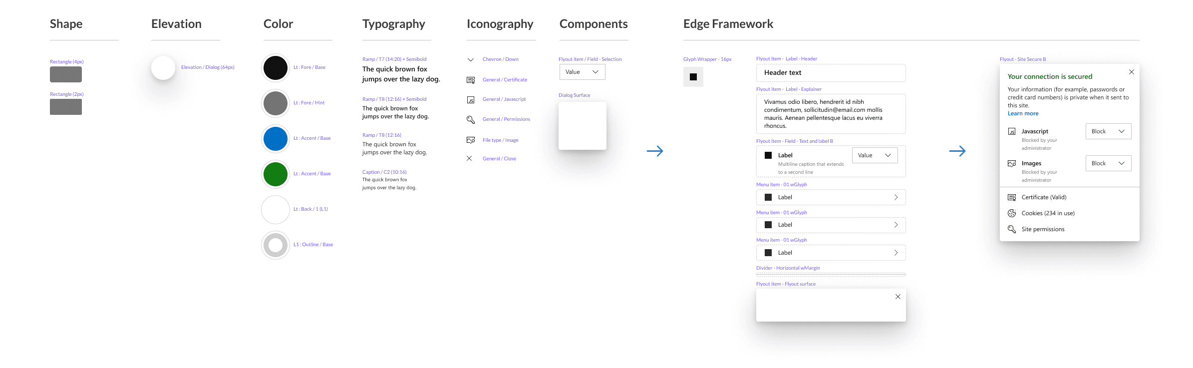
Creating the framework
Many design systems rely on sticker sheets, collections of basic components like buttons and dropdowns that designers manually assemble for each use case. While helpful, this often still leads to inconsistency, as components can be combined in countless ways.
In contrast, I built out a true atomic design system by starting with foundational elements (atoms), then combining them into reusable patterns (molecules and organisms), and finally into specific templates. This structured approach creates consistency, speeds up design work, and provides clear starting points for designers.

Internal teams as my user
The design system’s primary users were the designers and engineers on our team, considering their needs was key. I knew from experience that if a system felt slow or rigid, designers would avoid it, defeating its purpose. To encourage adoption, I focused on intuitive naming, clear organization, and a flexible structure that unlocked designers rather than limiting them.
The team had recently moved to Figma, which made sharing and collaboration seamless. I became an expert in Figma’s features and limitations, structuring my design system around Figma’s naming structure, allowing easy search.
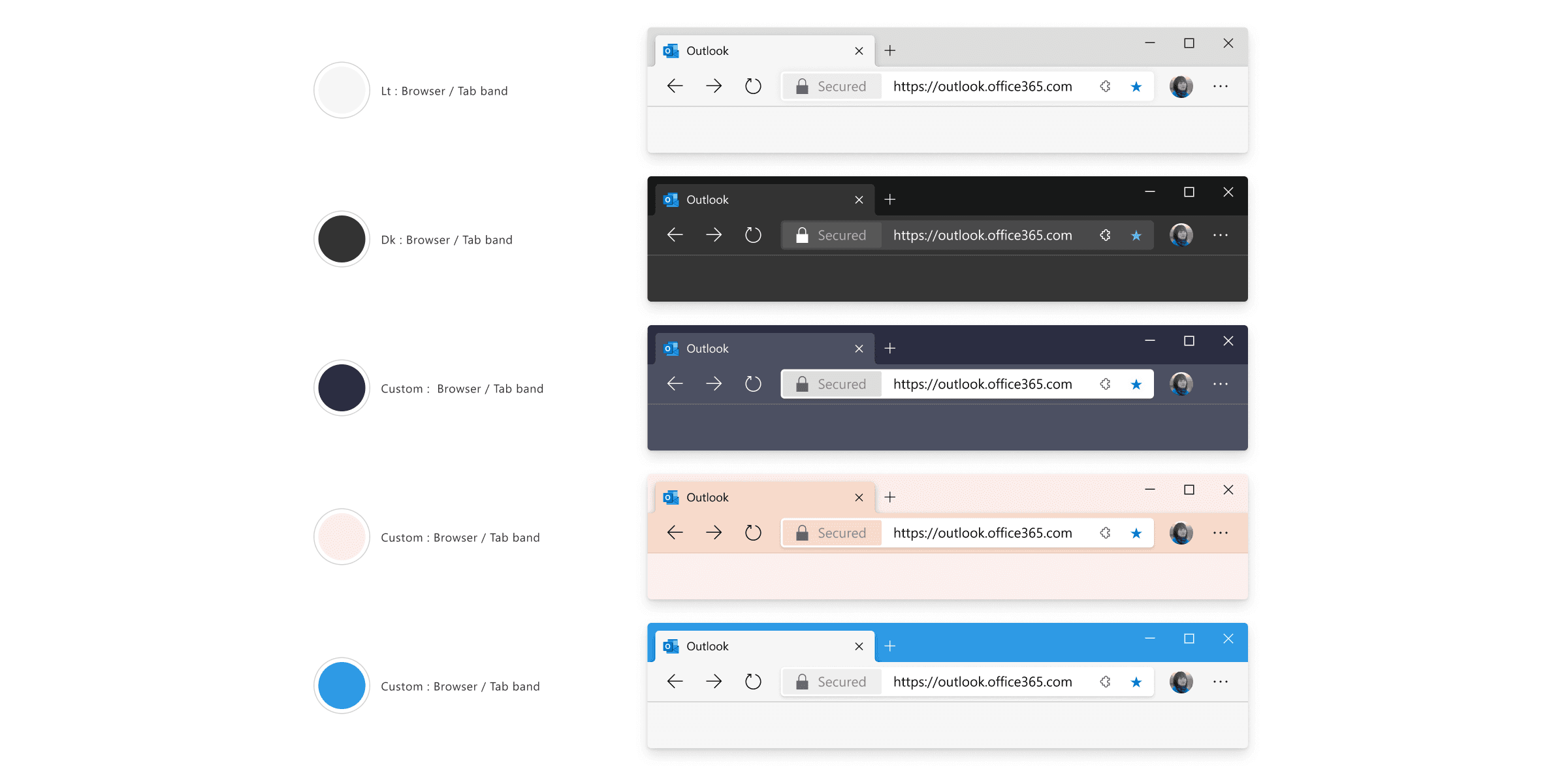
Design for customization
Customer feedback showed a need for greater browser customization, which meant supporting potentially hundreds of theme and layout variations. To address this, I built the design system to support both light and dark themes by default. For broader flexibility, I also created a series of “rigs”: adjustment files that let designers quickly swap colors, typography, icons, and shapes. This made it easy to preview how changes would impact the entire Edge system without manually updating each file.
Scaling the system
Building the design framework meant refactoring and organizing hundreds of Edge UI components. I followed an atomic approach, starting with small elements and building up, which worked well for component structure. At first, I applied the same naming convention to the Figma files, labeling components as atoms, molecules, and organisms. But many designers found this unfamiliar and confusing, which made the system harder to use and maintain. To fix this, I shifted to a semantic, feature-based organization. This made it easier to find, use, and update components, while still keeping the atomic structure under the hood.
Lessons learned
Create components early
Even if a component is still being defined, it's worth creating and adding it to the system early on. Figma makes it easy to update components later, so getting them in place helps keep files clean and reduces manual rework. Early implementation also encourages consistency as features evolve.
Educate the team
Design systems are still a new concept for many designers (even more so in 2019). Some challenges stem from unfamiliarity with Figma itself, while others are tied to adjusting to a new workflow. As I built out the system, I picked up countless workflow tips and tricks. I eventually compiled these into a shared resource for the team.
Dynamic, not static
A good design system should be built for change. In our case, color was the area where updates happened most often, driven by both accessibility needs and evolving visual direction. I worked closely with UX engineering to refine our color system. Thanks to the way I structured the Figma files, any color update in the master file automatically propagated to the rest of the system.
Documentation
Early on, documentation wasn’t a focus, which led to some confusion as the system grew. As the library matured, we created more detailed guides for both designers and developers. This even allowed PMs and engineers to explore the system and even mock up ideas without needing design support.
Closing thoughts
Building the system was a significant effort, but it quickly worth it. Before it was in place, designers were often fielding questions from PMs and developers about which design was the most current. Once the system launched, any file built with it could be trusted to reflect the latest UI.
Because design and code shared a common language, development sped up. Engineers could focus on functionality instead of layout, and designers could concentrate on user experience rather than visual polish.
With the Edge Framework in place, the team can now spend less time maintaining old designs and more time creating thoughtful, user-focused features that set the product apart.