Project Overview
Introduction
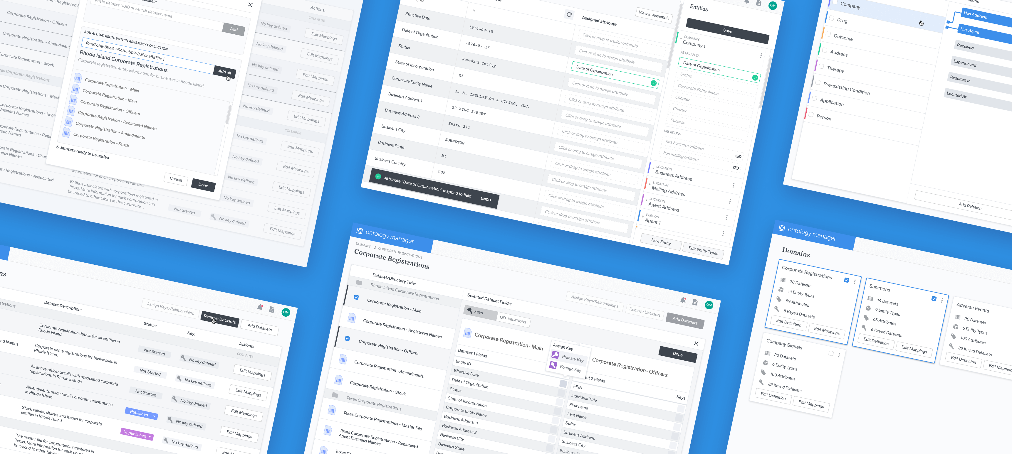
During the summer of 2017, I worked on designs for Enigma’s Ontology Manager, a tool for cleaning, enriching, and linking data. The project started as an internal tool for Enigma’s own team, but quickly grew to be a product in and of itself.
To comply with my non-disclosure agreement, I have omitted any confidential information in this project. The designs presented here may differ slightly from the production version of this product, and do not necessarily reflect the views of Enigma.
Introduction
My Role
I was the main designer tasked to this project. I worked alongside a team that included a project manager, front-end developer, and several back-end developers. As part of the process, I conducted market research, usability testing, prototypes, and produced implementation-ready specs over the course of about 3 months.
Introduction
What is an Ontology Manager?
Enigma was founded in 2011 with the goal of gathering and standardizing the world’s public data into one searchable, organized, and centralized place. Although public data is freely available, that doesn’t mean that it’s easily accessible. Crucial to making data useful is making it easier to comprehend. Because datasets often come from a variety of sources, there is a huge amount of redundancy between different data points. Two different agencies may release data that represents the same thing, but because of the way it’s reported, it might look like two separate things.
The key to the Ontology Manager lies in its ability to combine different data points from different datasets to make sure that they represent the same concept. In essence, the purpose is to generate linked, standardized, and machine-readable data.
What is an Ontology?
Put simply, an ontology is the formal naming, classification, and relationships between things. Anything that can be classified can be organized into an ontology. As an example, the classification of types of foods could be called an ontology.
When most people think of an ontology, the image of a graph comes to mind. The vertices of the graph represent all of the entities within the ontology, and the edges represent the relationships between those vertices.
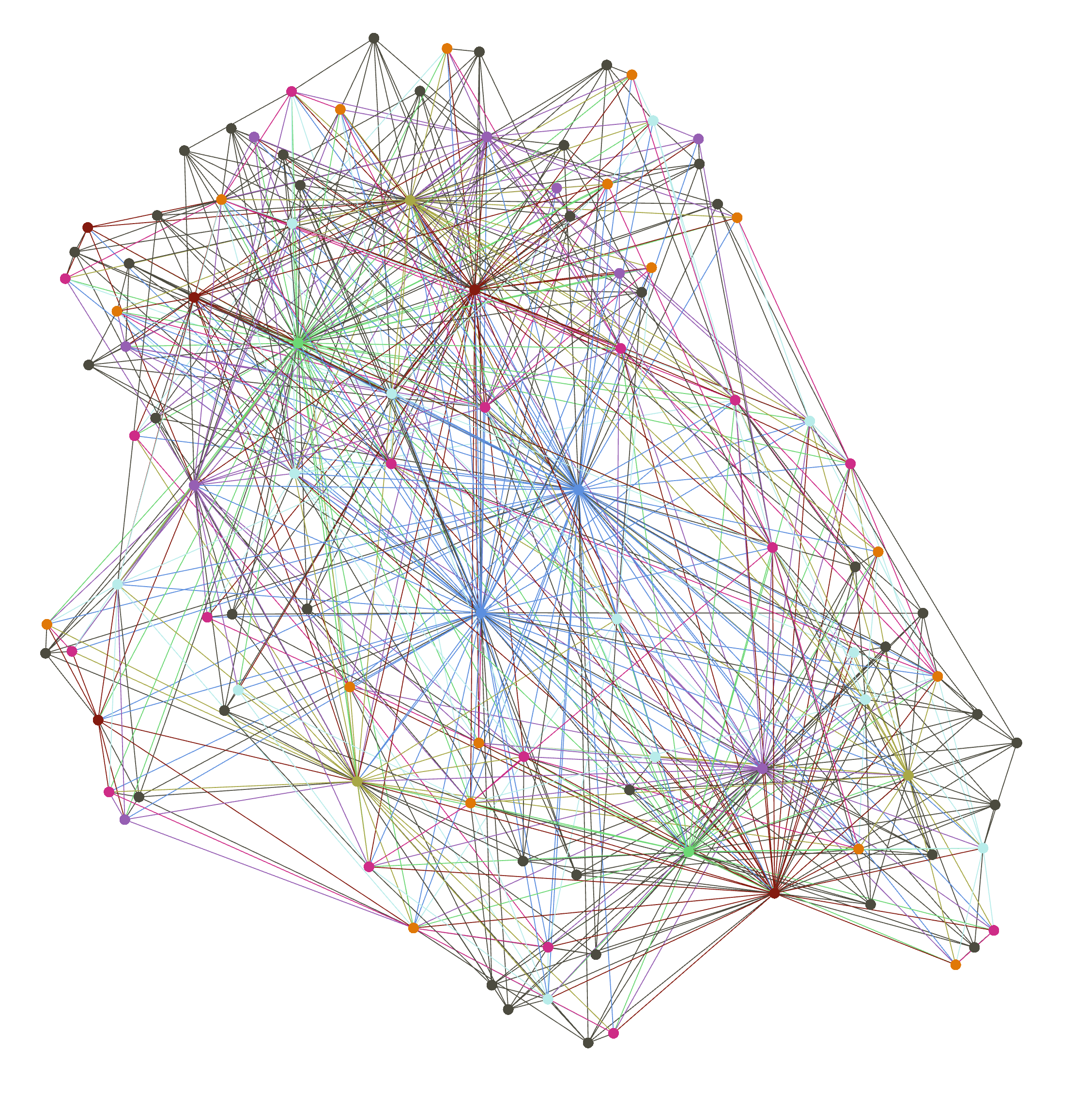
Although this is a visualization of what an ontology looks like, the Ontology Manager actually deals with setting up and tagging data prior to this output. The first way this is done is through mapping a pre-defined ontology to a dataset.
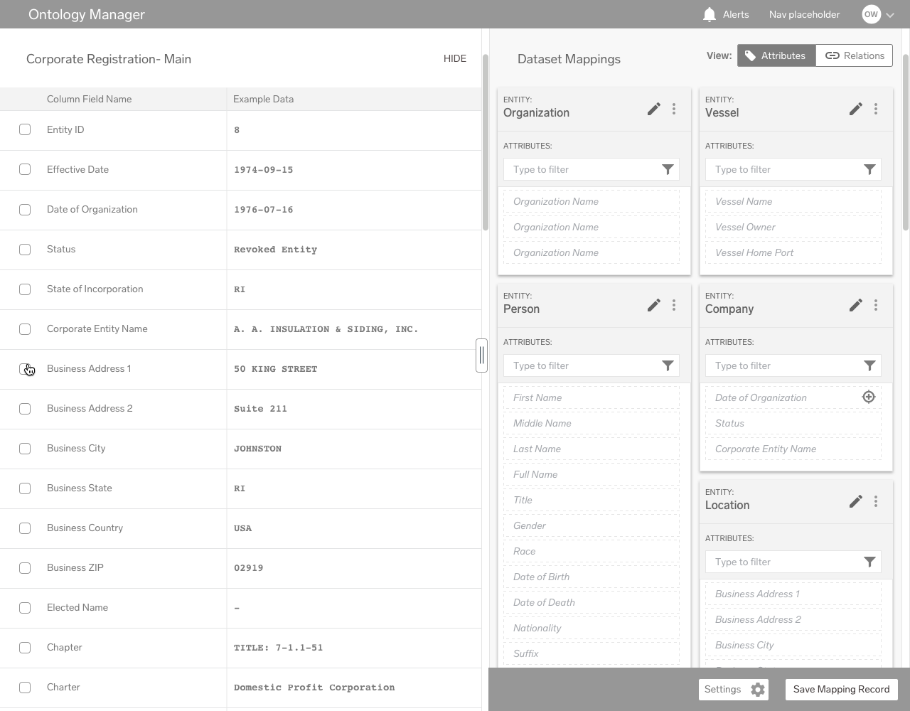
The process of mapping works through tagging dataset fields as representing a certain attribute. Any given Entity contains a certain number of attributes, and by mapping fields to each attribute, the user is able to assign different entities to different types of data. As an example, a color-coded dataset mapping might looks something like this:
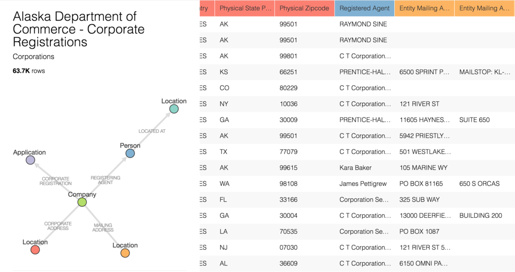
Dataset mapping is only one step in the process, however. Just as important is defining the relationships between different entities. For instance, a “Person” entity might have a relation “works_for” with “Company” relation. As a sentence, this would be read as “person works for company.”
Planning the Product
Design Architecture
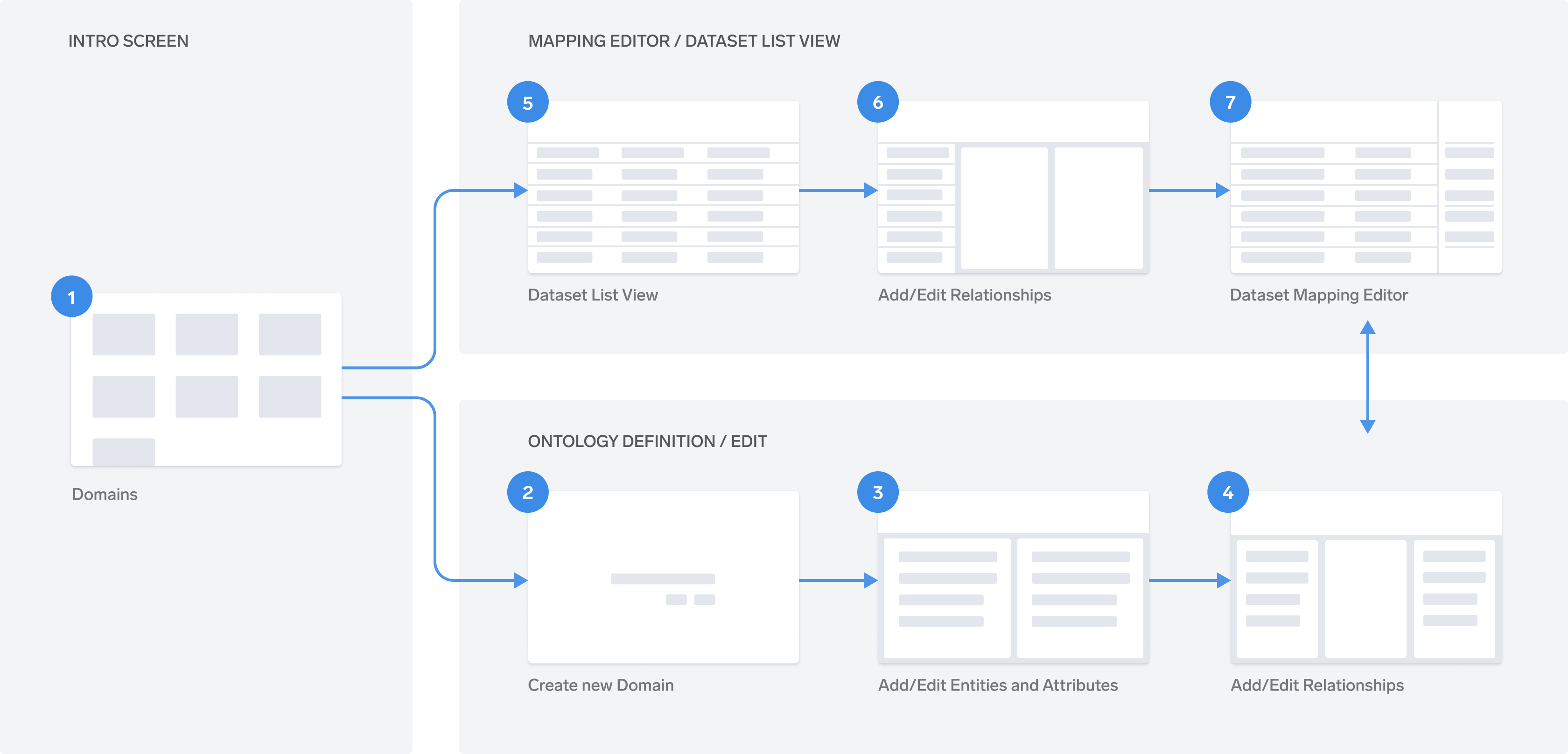
While designing a product that sought to achieve so much, getting a bird’s-eye-view of the product architecture was vital, not just for me, but to communicate with the rest of the team as well. I worked with the team to develop a sitemap and site architecture diagram to communicate the flow:
The Design
Balancing Speed, Usability, and Simplicity
From the beginning, I knew this was going to be a difficult undertaking. Enigma had made several earlier forays into creating a product with this functionality, but they were all either too complex, too limited in scope, or overkill for our purposes at the time. This time, we were committed to creating an ontology manager that was robust enough to be applied to many different types of data, but simple enough to be implemented quickly.
The biggest challenge was balancing these requirements. As I was working on the project, our deadline was pushed forward significantly, which meant that compromises had to be made on some of the more complex features. During user testing, it was clear that some of the concepts were confusing, even to employees at Enigma. Making the concepts as clear as possible was a priority.
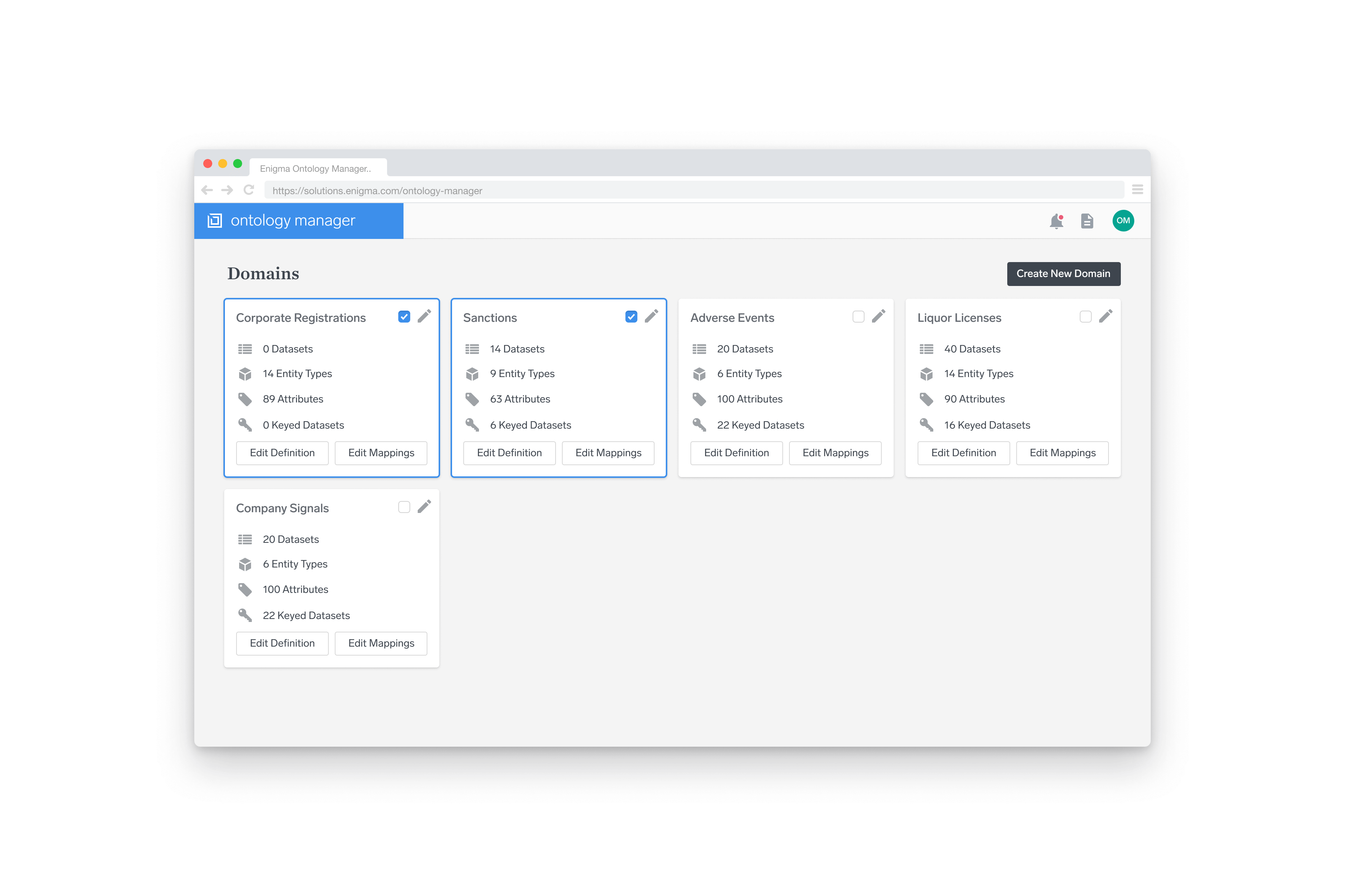
The design efforts focused on a few main areas. The landing page, shown above, provided an introduction to the product and offered an overview of active projects. The 3 features below formed the main interaction that the majority of users would interact with.
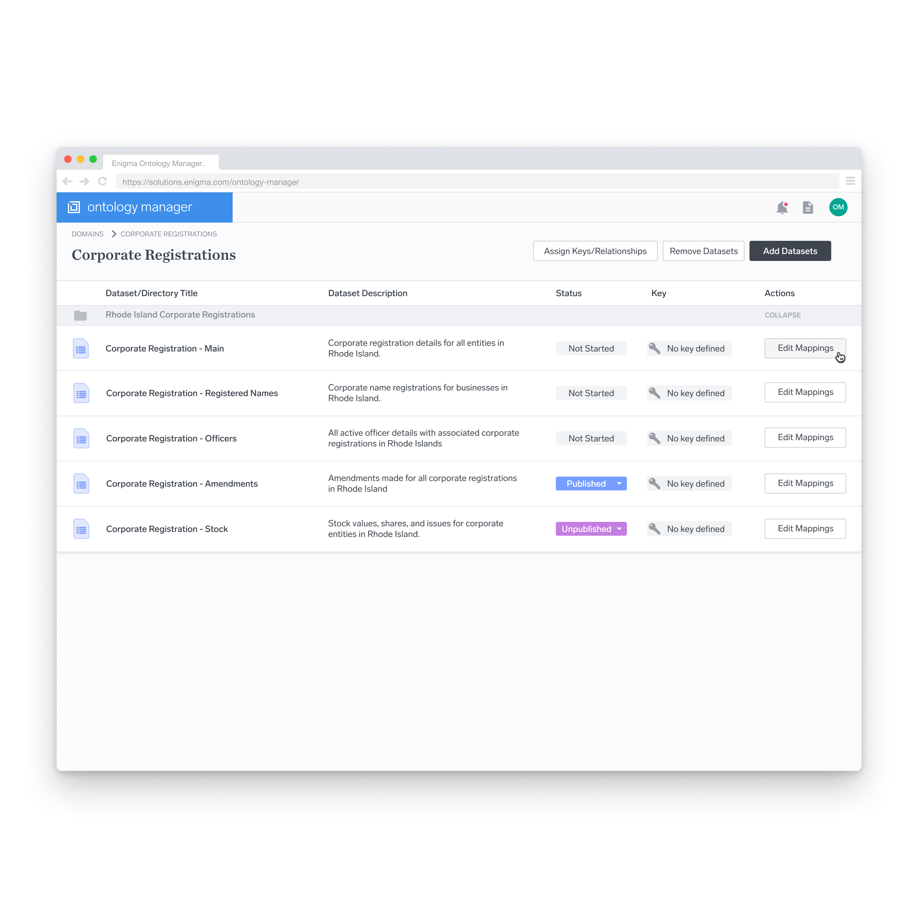
Dataset List View
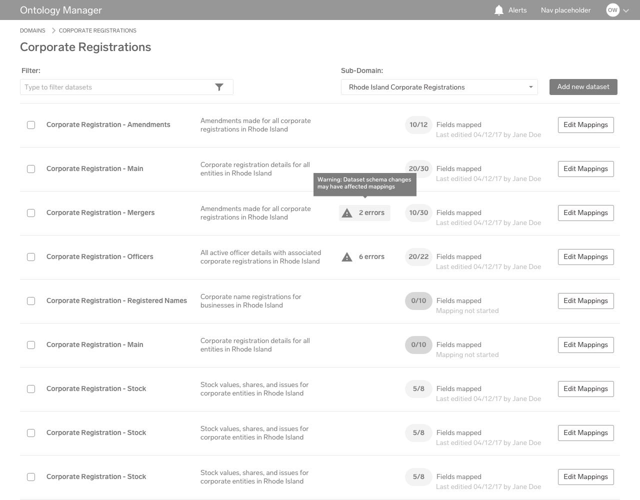
After descending into a particular project, the list of datasets relevant to that list is shown here. From this list, the user can access the main functionality of the other parts of the product. The list gives a brief overview of each dataset’s progress within a user’s workflow.
Relationships
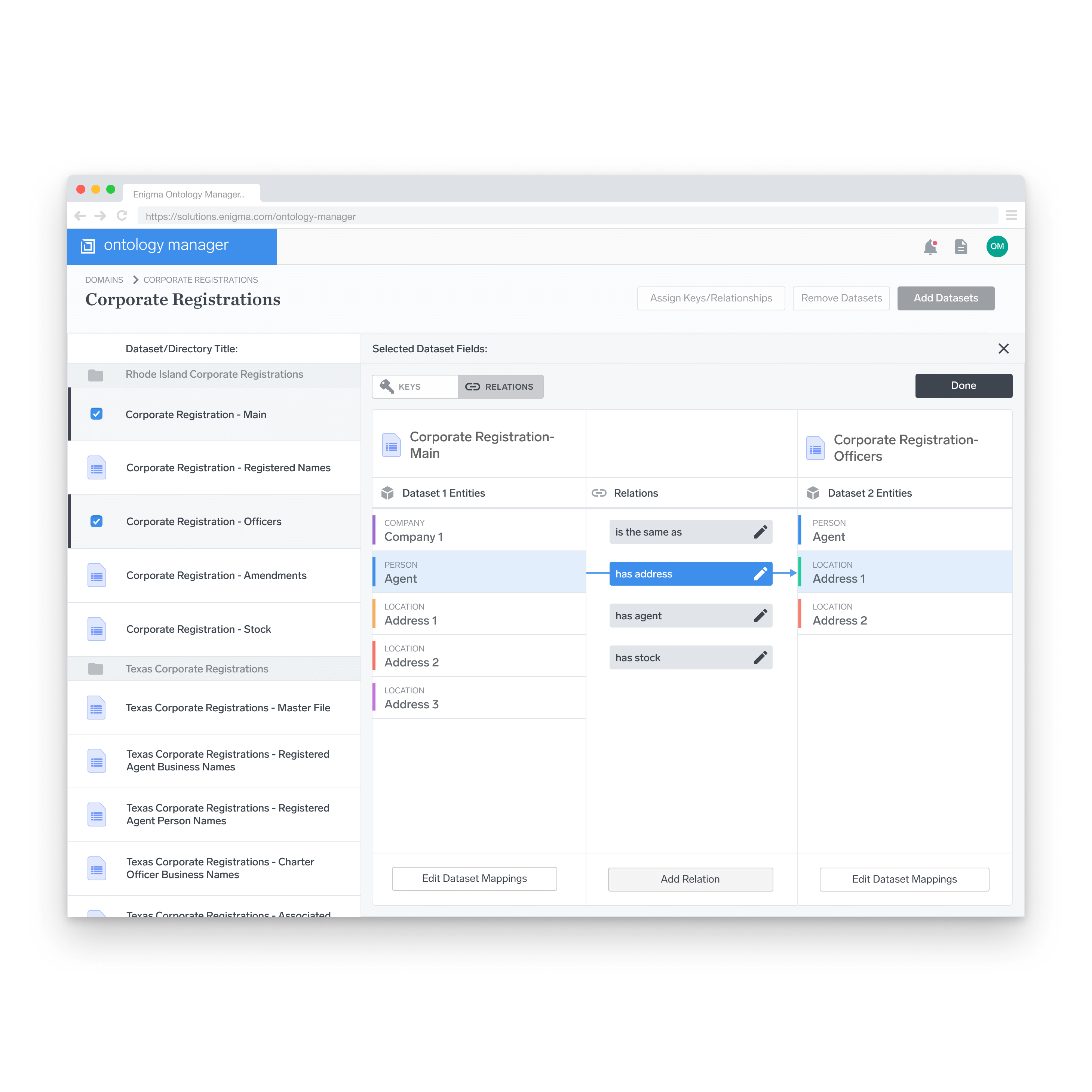
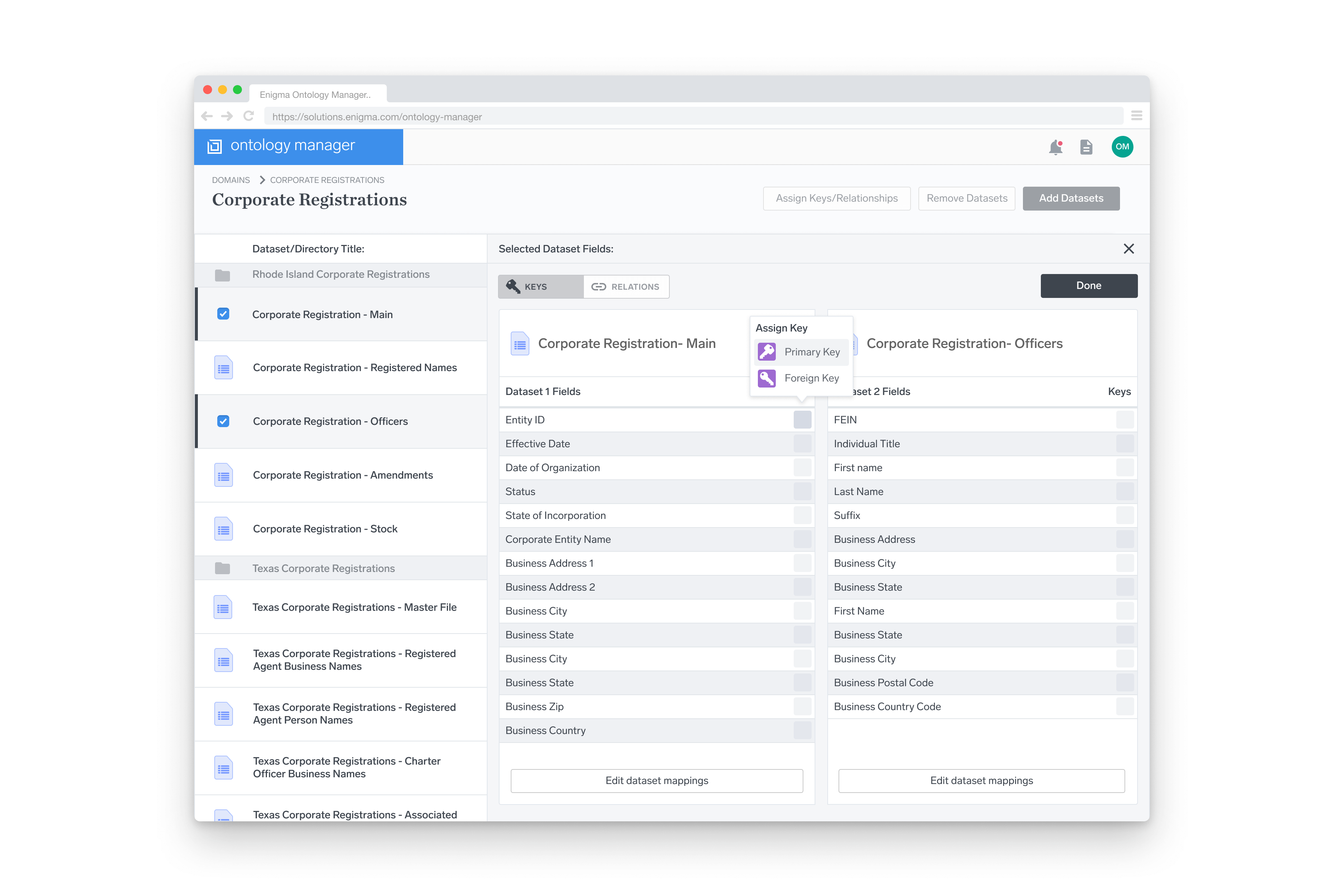
Inter-dataset relationships are created from this view. The relations between different entities are defined based on a certain set of rules that are established elsewhere in the product. In this example, relationships are defined between two different entities in two different datasets.
Mapping Editor
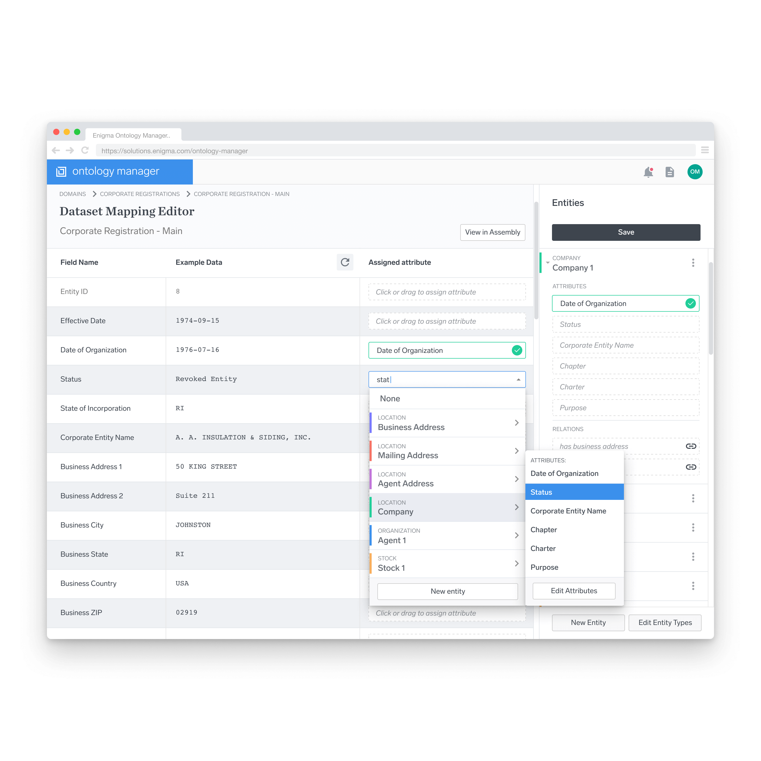
Here, individual datasets are mapped to attributes. Fields within the dataset are tagged via a dropdown menu, corresponding to an allowable list of attributes on the right sidebar.
Depending on the user’s preference, the workflow can function in one of two ways: either the user goes through the fields in the dataset on the left mapping attributes to the fields, or the user uses the sidebar on the right and maps fields to attributes.
Ontology Definition
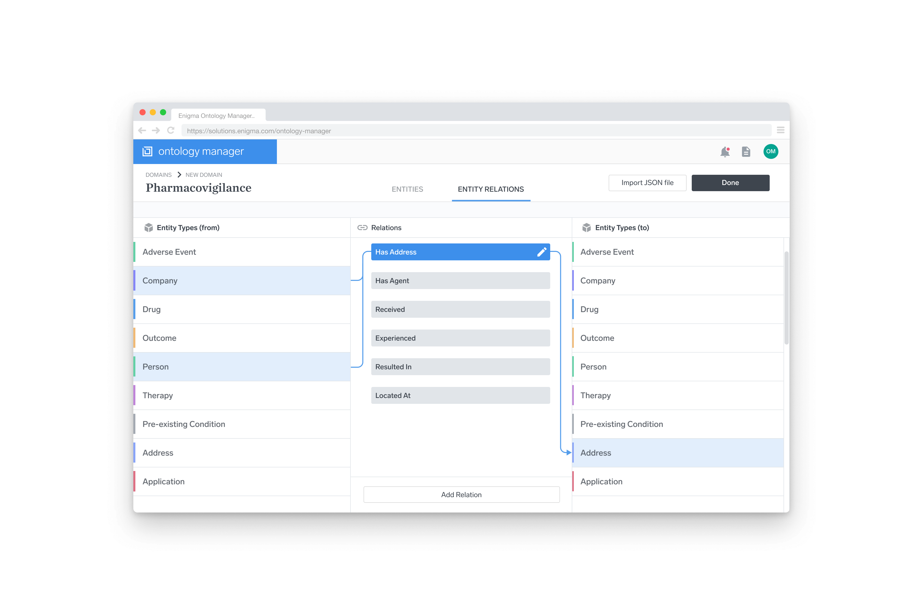
As the design process neared the end, our thinking changed. Previously, we had anticipated that the creation of the rules behind each ontology would be defined once, by an engineer writing a JSON file. This assumed that the ontology rules would be very rigid, and put a lot of pressure on getting it right the first time. The more thinking that we did, the more we realized that it made sense to provide a visual interface for setting up the ontology definition as well.
Although it was the last major piece that I designed, the requirement was that it be the first thing that was implemented. As such, I worked closely with our front-end developer to design something that could be implemented quickly, while leaving room for improvements down the line.
The system we came up with for defining relations was a 3-column layout, with the outer two columns representing all of the entities within a specific ontology, and the inner column representing the allowable relations between those entities.
The Approach
Design Validation and Testing
The first users of the Ontology Manager were to be internal Enigma employees. This provided us with lots of people to consult for feedback along the way during the design process. Feedback from the casual usability tests that I conducted early on had a big impact on the way the design was implemented. Early issues that we caught helped streamline the design and eliminate unnecessary steps.
At the time of writing this, development is still ongoing on the product, but once it launches, we’re planning on using Enigma as a test-bed for the product before a wider release.
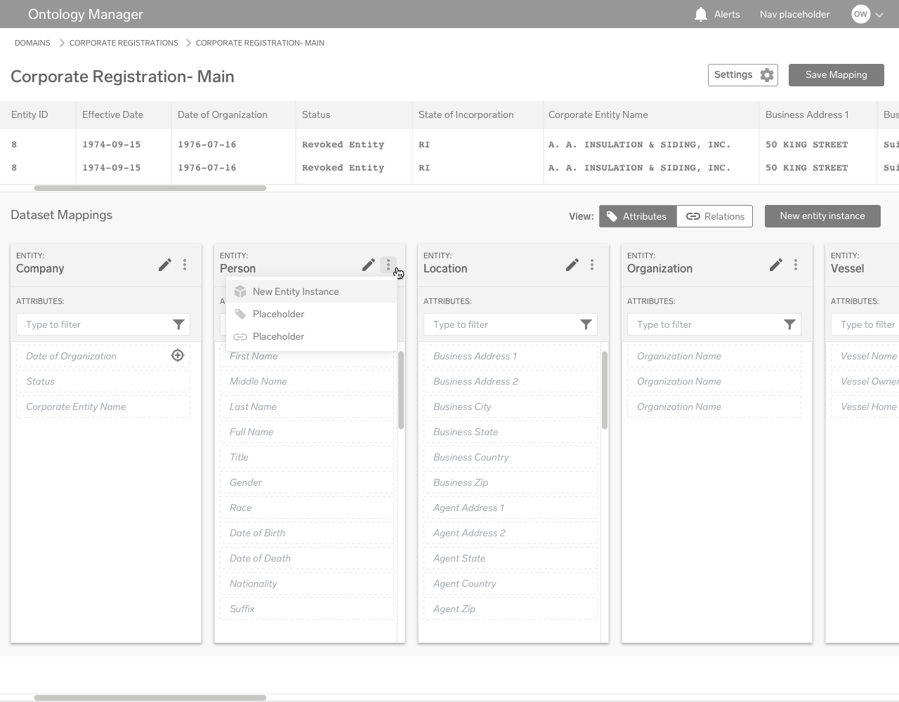
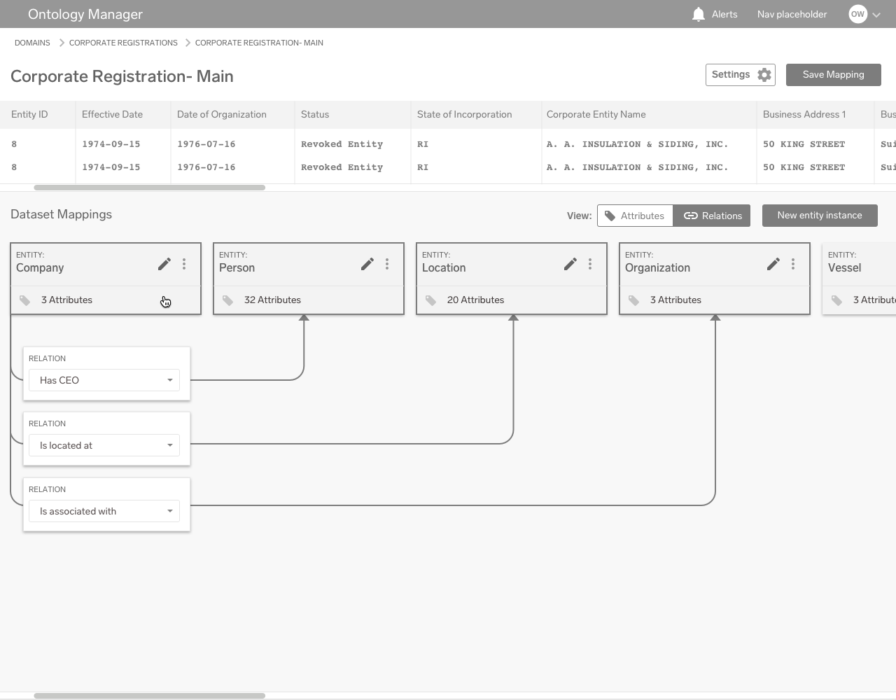
Here are a few unused wireframes from early in the design process:
The Approach
Compromises and Scale-Back
For the entity linkages screen, I had initially imagined a complex pannable, zoomable graph to form the bulk of the interaction. However, due to time-constraints, we had to scale this back significantly. Because relationships were just one piece of the puzzle when it came to the design, it seemed illogical to devote such a vast amount of resources to develop it.
Some of my proposed graph-style interactions:
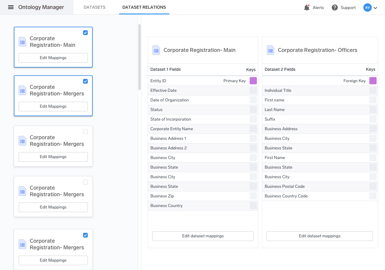
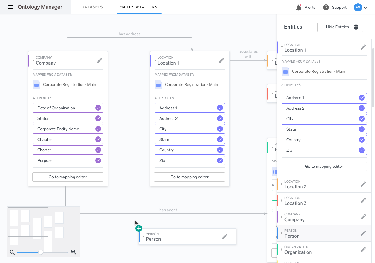
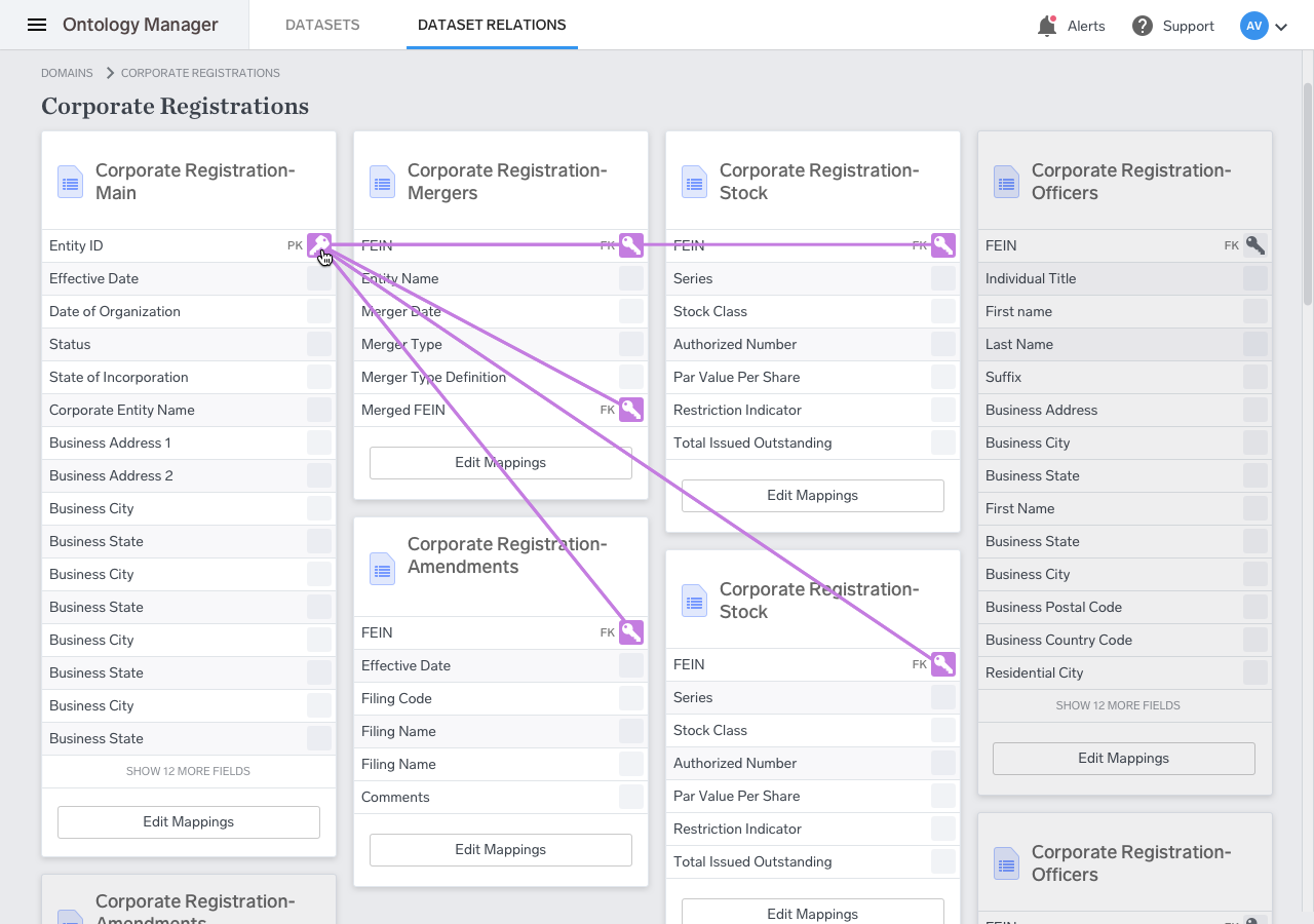
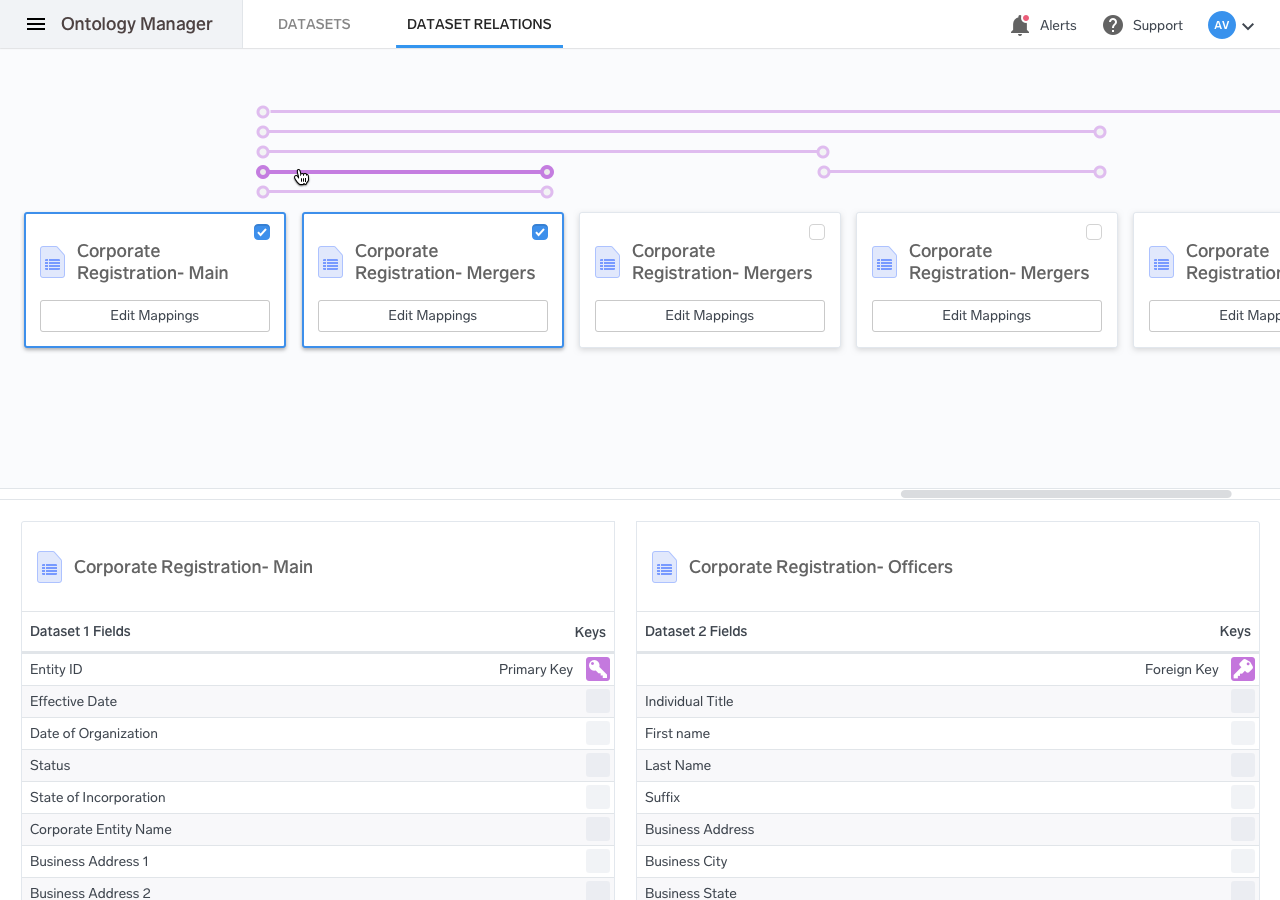
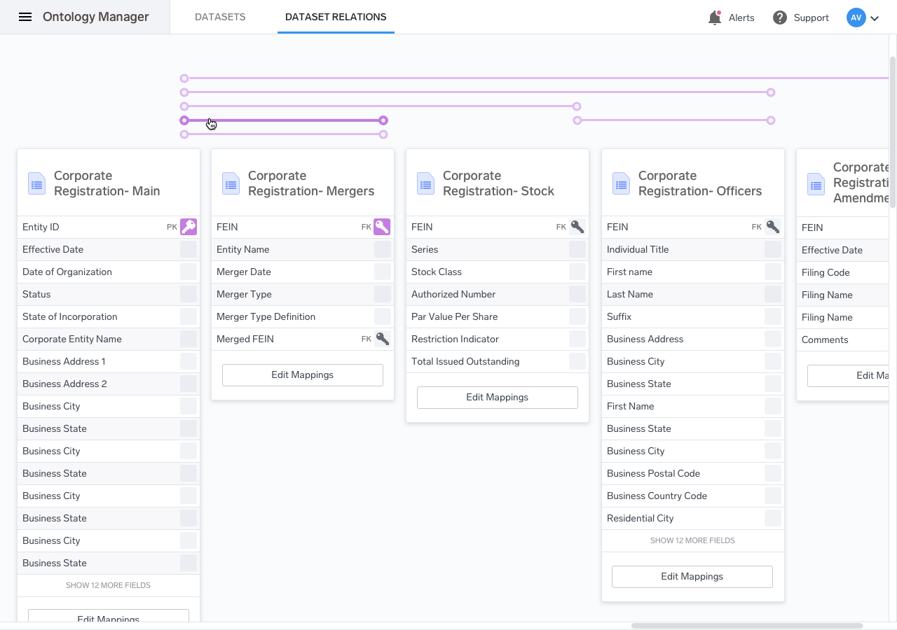
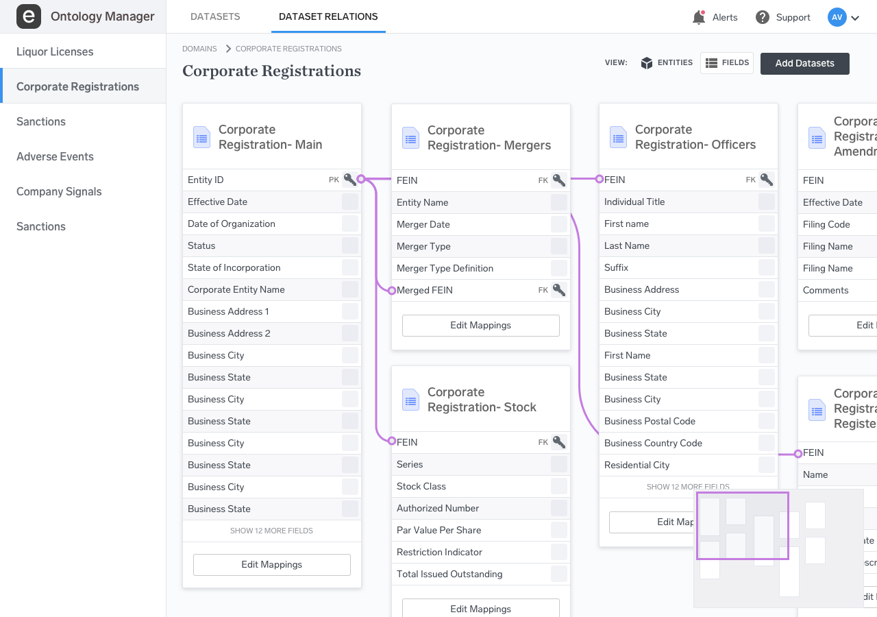
The solution we came up with was to only allow the user to select two datasets at a time and add relations between them. The disadvantage was that it didn’t allow for a holistic view of the entire set of entities, but that was a compromise that we were forced to make.
Next Steps
The Future of the Ontology Manager
As the focus on artificial intelligence has grown, the Ontology Manager has been at the forefront of Enigma’s efforts to provide better data management solutions. At the time that I left Enigma, the Ontology Manager was an internal tool used by a handful of employees. Now, the Ontology Manager power’s Enigma’s new, graph-based search tool using the entity classification system that I designed.
My work on the product laid a foundation for Enigma to be well positioned. The Ontology Manager has now shipped externally to other companies as part of Enigma’s knowledge graph offerings, and it has continued to evolve. While I was working on the product, it was still very much a v1 meant to power artificial intelligence. Now, artificial intelligence is beginning to be used within the ontology manager itself. Much of the intensive manual work of entity mapping is ripe for automation, and perhaps, the need for a visual UI will be reduced.