Project Overview
Introduction
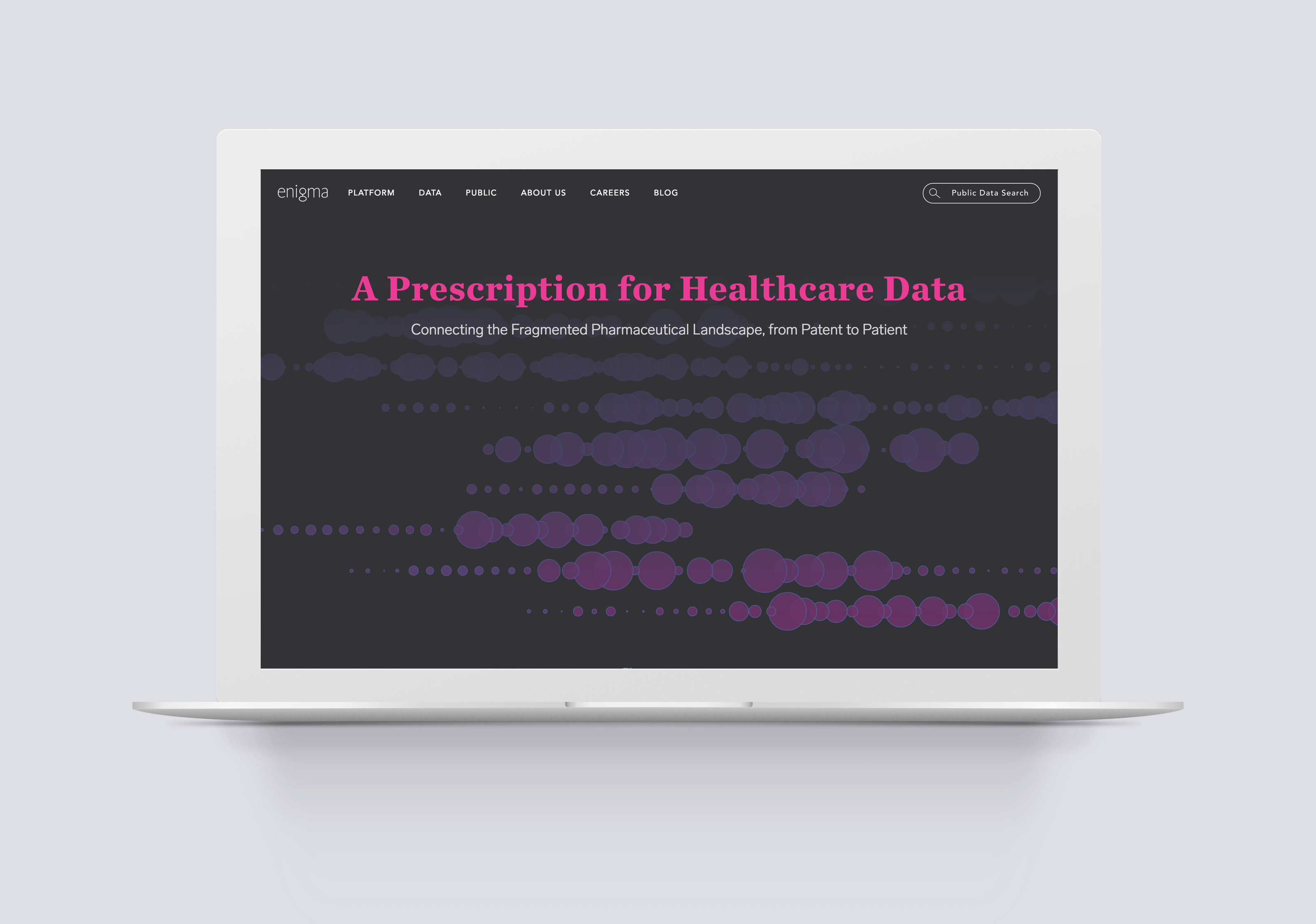
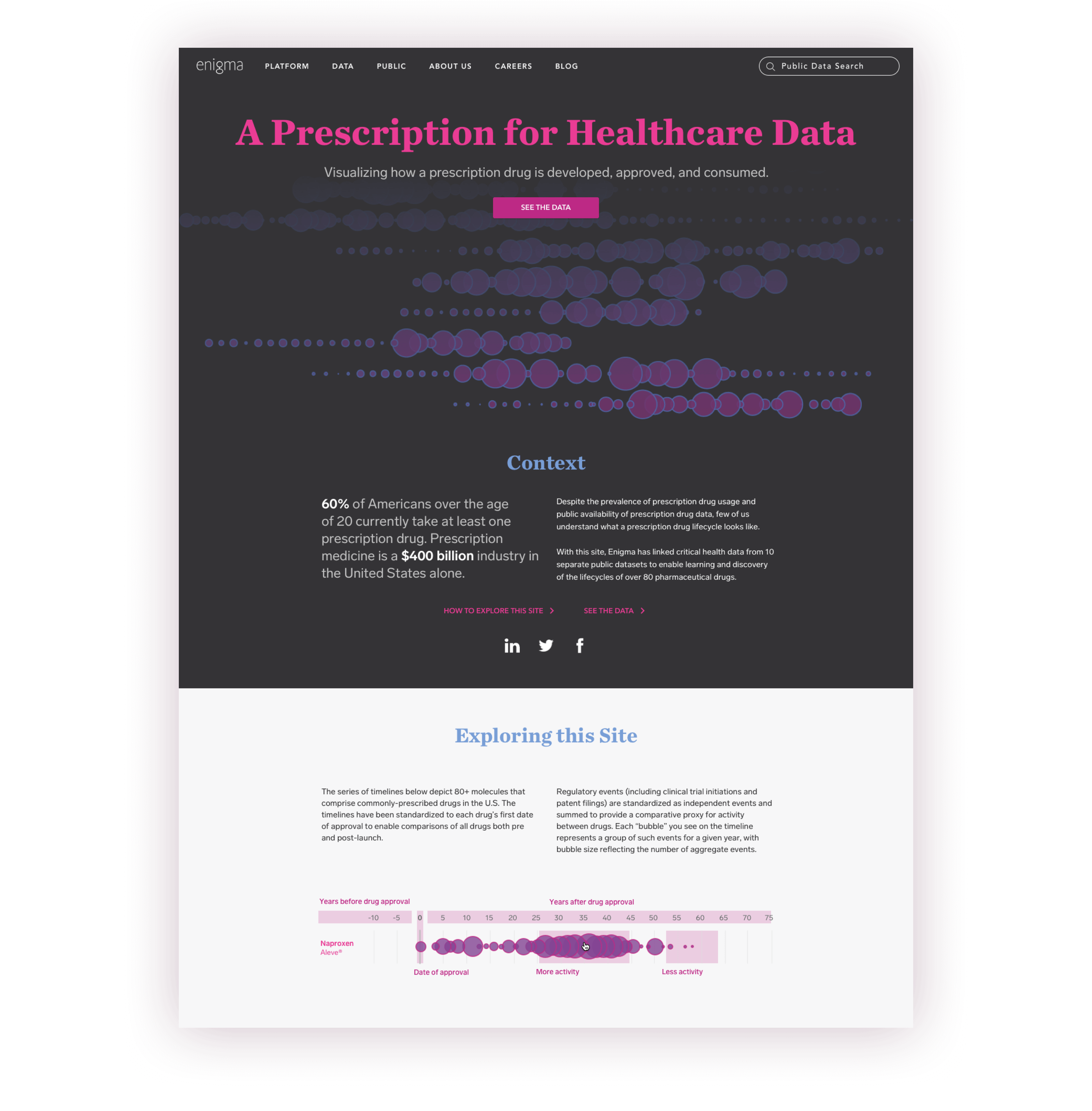
In December 2016, Enigma launched A Prescription for Healthcare Data, a site designed to showcase Enigma’s ability to synthesize data from various sources into a cohesive narrative that users can derive insight from.
Disclaimer: the designs presented here are may be reinterpretation of the original, and do not necessarily reflect the views of Enigma.
Project Overview
My Role
As the designer on this project, I worked closely with a small team of front and back-end developers, copywriters, and marketing and healthcare experts to create the site over the course of about 6 weeks.
A mixture between a marketing site and a tool, it was important to strike a balance between creating something that immediately captures a user’s attention, and something that is is functional and useable.
Goal 1
Develop a site that showcases the vast amount of data that Enigma has access to, and to demonstrate that this data can be pulled together into something useful.
Goal 2
Allow people to gain a more in-depth understanding of the process of pharmaceutical drug development, approval, and consumption.
Goal 3
Use the site to raise awareness of the Enigma brand and the products and datasets that we sell. Create a site that is of interest to potential clients in the pharmaceutical industry.
The Main Site
Introduction + Context Module
The main introduction to the site serves to give the reader a little bit of context into the pharmaceutical industry and the state of public data on healthcare.
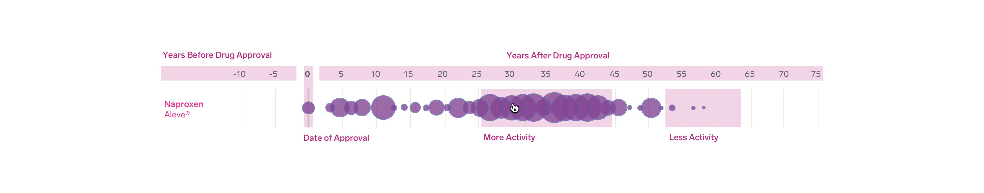
It also provides an introductory chart that helps the reader understand how to make sense of the following visualization.
The Main Site
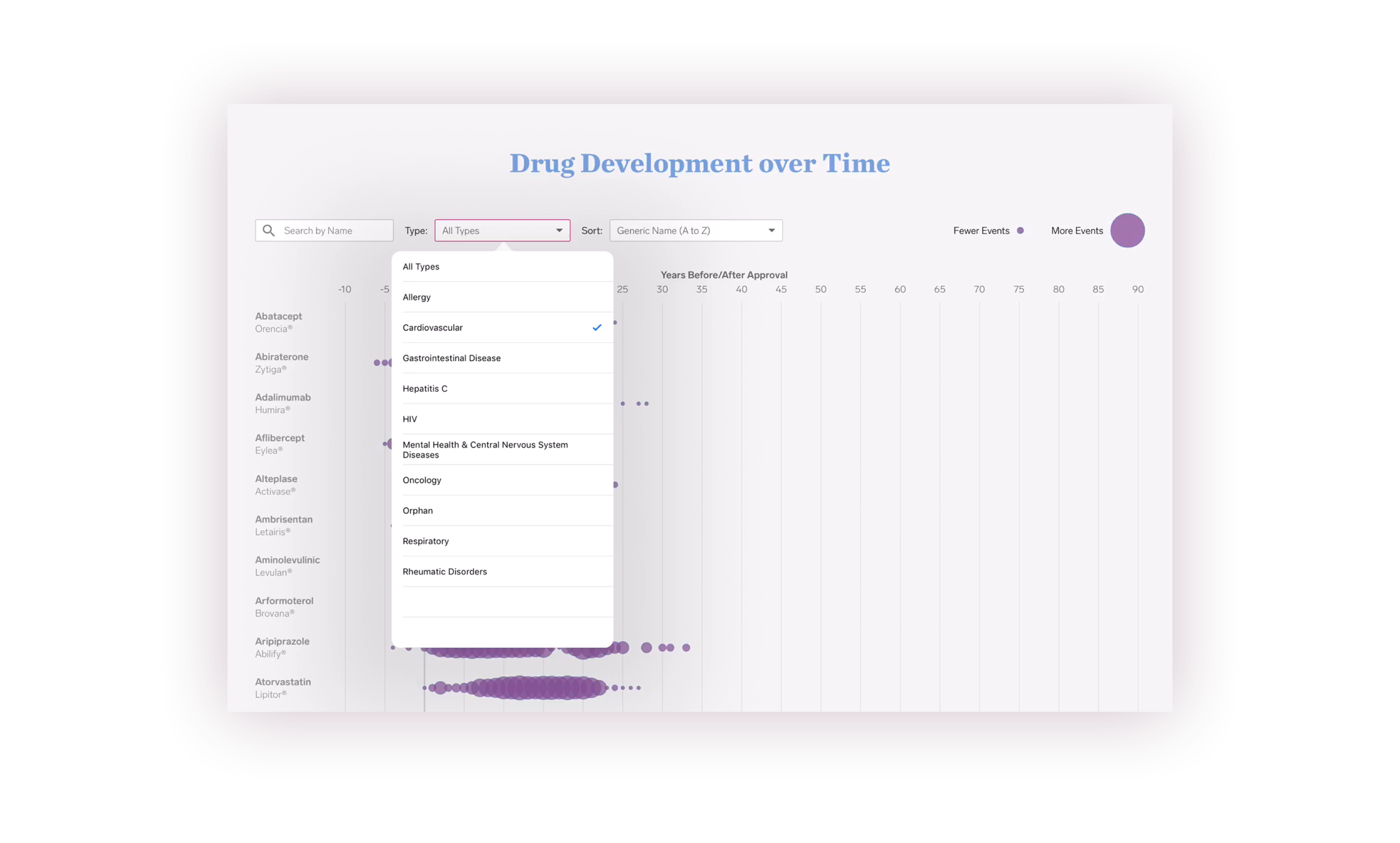
Drug Overview Portion
The drug overview section forms the core visualization for the rest of the site, and sets the precedent for the page that follows. We decided to represent each drug by a bubble chart, with each bubble representing the total number of “events” for any given year in the drug’s life. An event, for example, could include items such as FDA approvals, patents, and clinical trials.
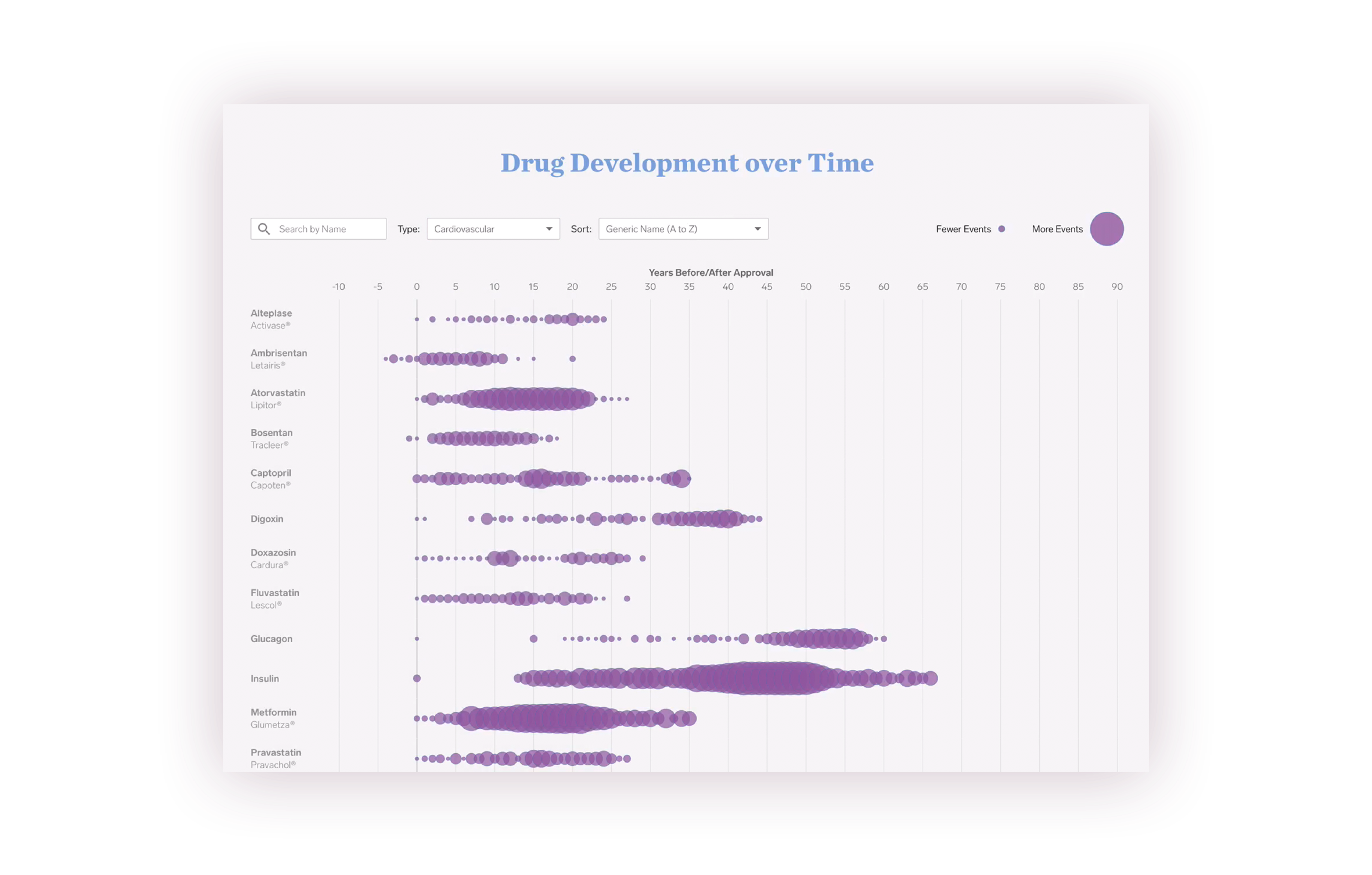
The dynamic list of over 80 drugs is sortable by a number of factors. Users can filter by the name of the drug, and also by the type of disease it is meant to treat. The chart provides a tooltip to give an overview of high-level statistics such as medicare spending per year, the number of years the drug has been on the market, and the drug’s cost per unit.
Drug inspector
The Drug Dashboard Inspector
After clicking into a drug on the main timeline, the user is brought to the drug dashboard inspector page for a much more in-depth view of a specific drug.
This page is broken up into three distinct tabs, each of which shows a graphical representation of various types of events, including patent approvals, deaths and injuries related to each drug, and Medicare’s spending on each drug.
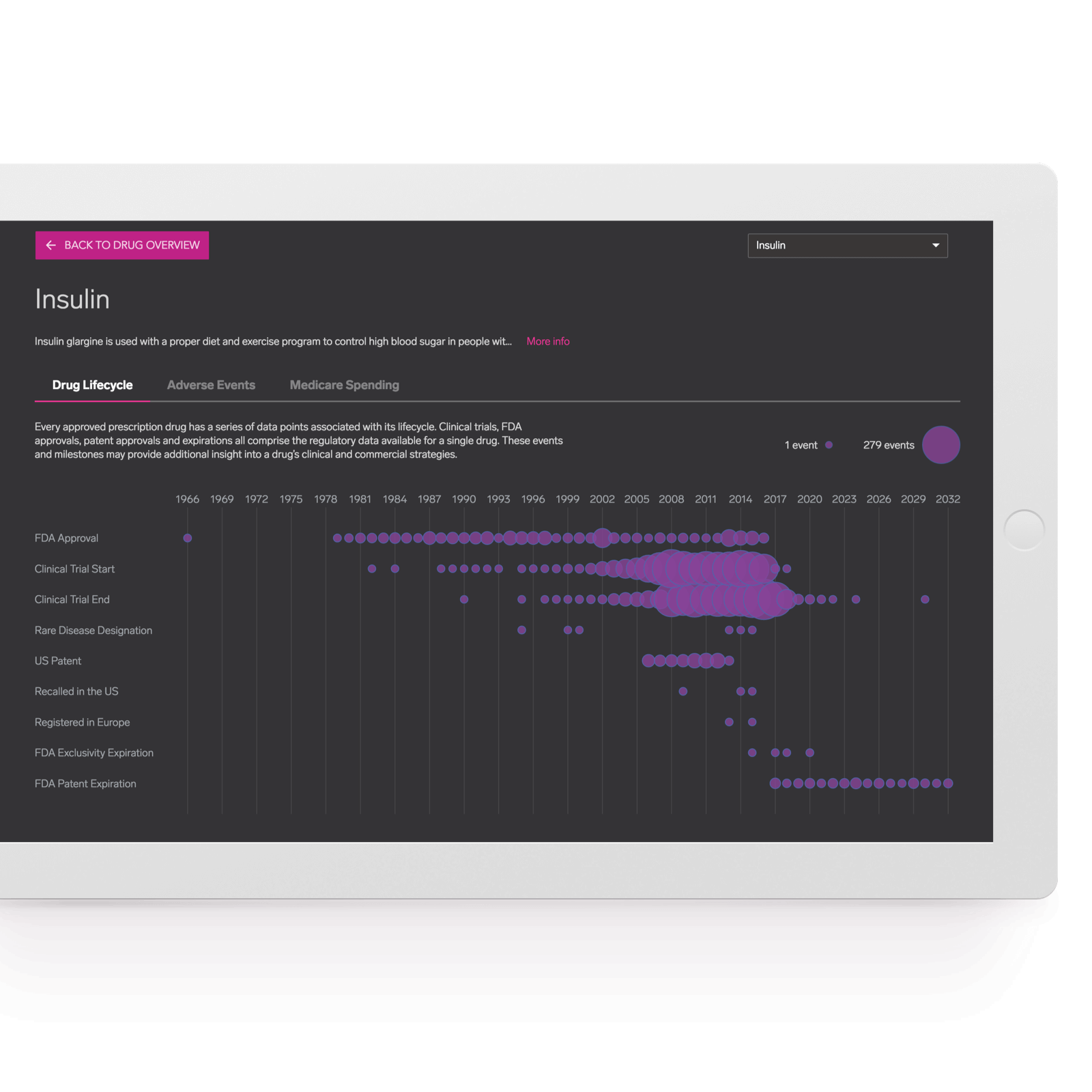
Lifecycle Tab
The drug lifecycle tab shows a timeline for events relating to the drug and data points associated with it. For example, the viewer can see all of the patents associated with a drug, and all the patent expirations that are scheduled in the future.
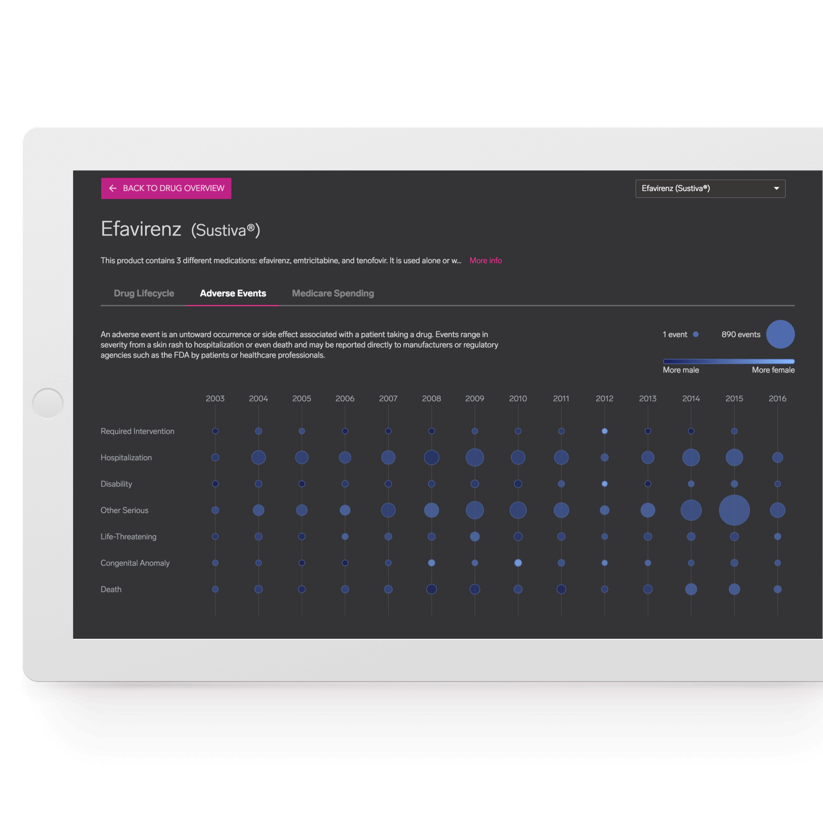
Adverse Events Tab
Viewing the adverse events tab gives the viewer insight into all the unwanted events associated with the drug, and how they potentially affect males and females differently. Originally, we had hoped to integrate these data points into the first tab, but unfortunately, data was only available from 2003 onwards.
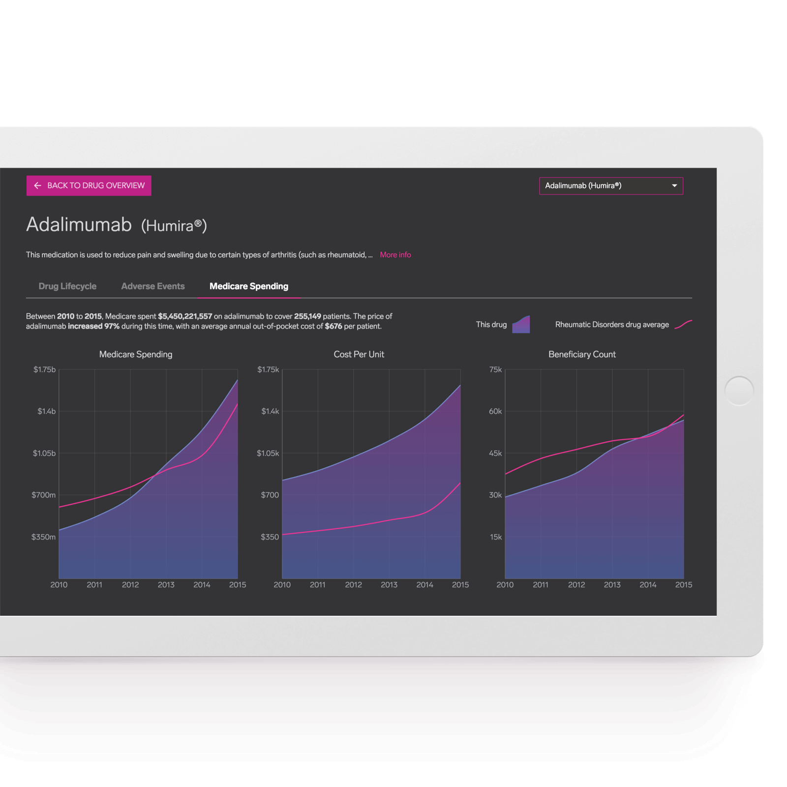
Medicare Data Tab
The medicare data tab gives an overview of amount spent on a drug by medicare. The staggeringly high numbers often reach into the billions of dollars, and for many drugs, the numbers have more than doubled in the past 5 years alone. The tab also gives an overview how the cost per unit has risen over time, and how the beneficiary count, or the number of patients that use the drug through medicare has risen. Unsurprisingly, the steep increase in spending is directly correlated with these changes.
Design Process
Initial Spec
Originally, this project was meant to be a relatively small, lightweight site. Ultimately, the scope of the project grew to encompass much more than that.
Rough Wireframes
The biggest task for me was to determine the main way that the data was going to be visualized. Initially, it was unclear to all of us how the data was going to look, so many different ideas for the visualization were explored.
Initially, we were looking for a way to display every single piece of data relating to a single drug on one graph, but this proved very difficult for a number of reasons. Importantly, the different datasets that we pulled our data from used vastly different scales, and in many cases, different units. For a given year, a drug could have tens of thousands of adverse events, and only one or two patents. Additionally, we found out that many data points only began to be reported after a certain date, meaning it was impossible to paint a complete picture on a single graph.

Post-Launch
Key Takeaways
Ultimately, working on this project gave me great as an end-to-end designer working closely with a small team. As one of my first projects of my job, it was the first time I ever saw my designs brought to life by a developer, and it was the first time I witnessed the complexity that can accompany that.
If I could do one thing over again on this project, it would be to ask questions early. I realized that in many respects, the other stakeholders in the project hadn’t thought through all of the edge cases and issues themselves, and by asking questions, I was able to surface issues that nobody had addressed.